


User perception of an MS Power BI Reporting solution can be damaged by poor performance. Whether they are waiting for content to load or refresh, or just having trouble navigating round a report page, how our reports perform is crucial for forming the impression of a trustworthy analytical solution.
When building your MS Power BI reports, the first thing to remember is that every visual runs its own query – the more visuals you have, the more queries are being run at load or refresh time.
With the following 7 tips, you will help make your reports run much quicker and be the go-to place to get reliable information.
Tip 1: Limit the number of visuals on a page
It’s very tempting to maximise the available space on a report page by squeezing as many visuals on to it as you can. Or worse yet, increasing the canvas size to fit more visuals on to it – nobody likes scrolling through a page full of charts.
Putting a large number of visuals onto your report page will really impact the interactive experience and cutting down just 1 or 2 visuals can really make a difference without impacting the story flow – spreading your visuals out over more pages will give you the chance to add more of an emphasis to what the data is saying, instead of it being lost in a crowd.
Tip 2: Pre-filter data selections for the initial load
Not every report needs to give a headline figure before users start filtering down on it. In some cases it results in charts looking too cramped and it can really add to the load time in a report.
If the initial load is really slow, pre-filter the content by selecting values in visuals before saving and publishing the report. A good example of this is where you have the ability to filter over multiple years of data across your visuals. Setting the initial filter in the filter panel to be the most recent year before publishing the report allows you to speed up your initial load.
Also consider using row level security to automatically filter the report for users according to their job role. Changes such as this can really speed up the report load time and improve the user experience.
Tip 3: Avoid using high volume, detailed tables on your pages
A lot of people prefer seeing data in a table rather than in a chart. This results in report pages where you have very few charts and a big table full of a lot of data.
This can answer a user need, but doesn’t always give a good idea about data trends and can also mean you are pulling a lot of data into your report, where someone potentially has to do a lot of scrolling to get the data they want.
Instead, consider if this is best delivered as a paginated report and keep the standard reports telling data stories.
Tip 4: Avoid using bi-directional cross joins on your tables
The ability of setting a join to filter in 2 directions can be quite useful if the relationship between tables isn’t in a typical hierarchy. It is also used in reports where there are a lot of slicer visuals and the report designer wants each visual to filter the other visuals based on the user selections.
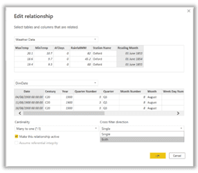
This can look quite effective for retaining the context of user filter selections across multiple slicer visuals, but it can also make the report quite a bit slower. Only using bi-directional cross joins when you absolutely have to will give you a performance boost.
Tip 5: Stop all visuals filtering all other visuals
By default, MS Power BI Desktop sets all visuals to filter the other visuals when you click on a value. Because every interaction of this type results in the queries that populate visuals being re-run, it can mean you are running more queries than you need to, every time something is clicked on.
Thinking about the flow of the data story you are showing and deciding how visuals filter one another can make quite a difference to how performant your report is. This is especially the case when the report uses on-premise DirectQuery data sources.
Tip 6: Use the filter panel instead of the slicer visual
Sometimes it is necessary to allow users to filter on a lot of different dimensional data, whilst showing very few visuals on a page (see Tip 1). Whilst it’s nice to allow users the freedom to really slice and dice the data in this way, it’s worth bearing in mind the slicer visuals still have a performance overhead associated with them, in terms of query processing and time to draw the visual on the page.
Although the slicers can be formatted to look better than the examples above, it can give quite a performance benefit to remove them altogether and allow report consumers to instead use the filter panel on the right of the page. There is very little performance cost associated with the filter panel, compared to the slicer visuals and it also means you have more page space to show the analytical components of your data story.
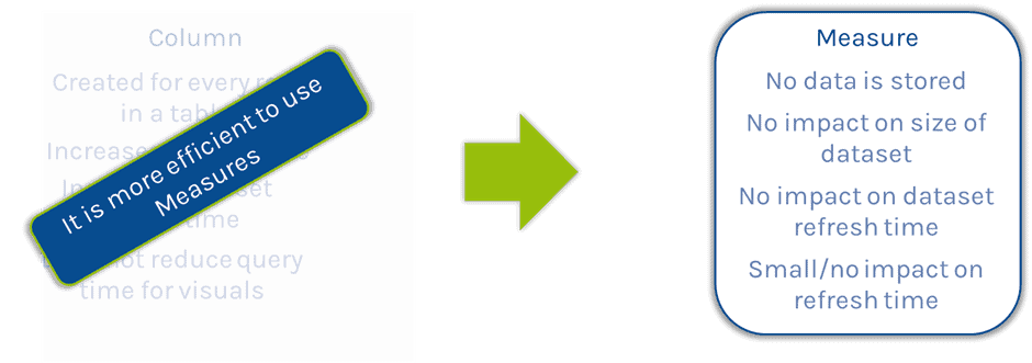
Tip 7: Stop using columns when you should be using measures
This last tip almost feels quite controversial but it shouldn’t be. Whenever you create a column, it requires space in the dataset, can impact dataset refresh time and does little to improve the refresh time of visuals.
In contrast, measures are stored in definition only, there is no data storage overhead associated with them. They are only utilised at the point they are used in a visual, so as a result of that there is no impact on the size of the dataset and no impact in the refresh time of the dataset.
Measures represent a no-brainer performance improvement over columns and should be the default choice for creating calculations instead of columns.